These maps show how pollution from burning fossil fuels (greenhouse gas emissions) is affecting our climate and communities, and the power we have to curb the worst of climate change by taking action to reduce it.
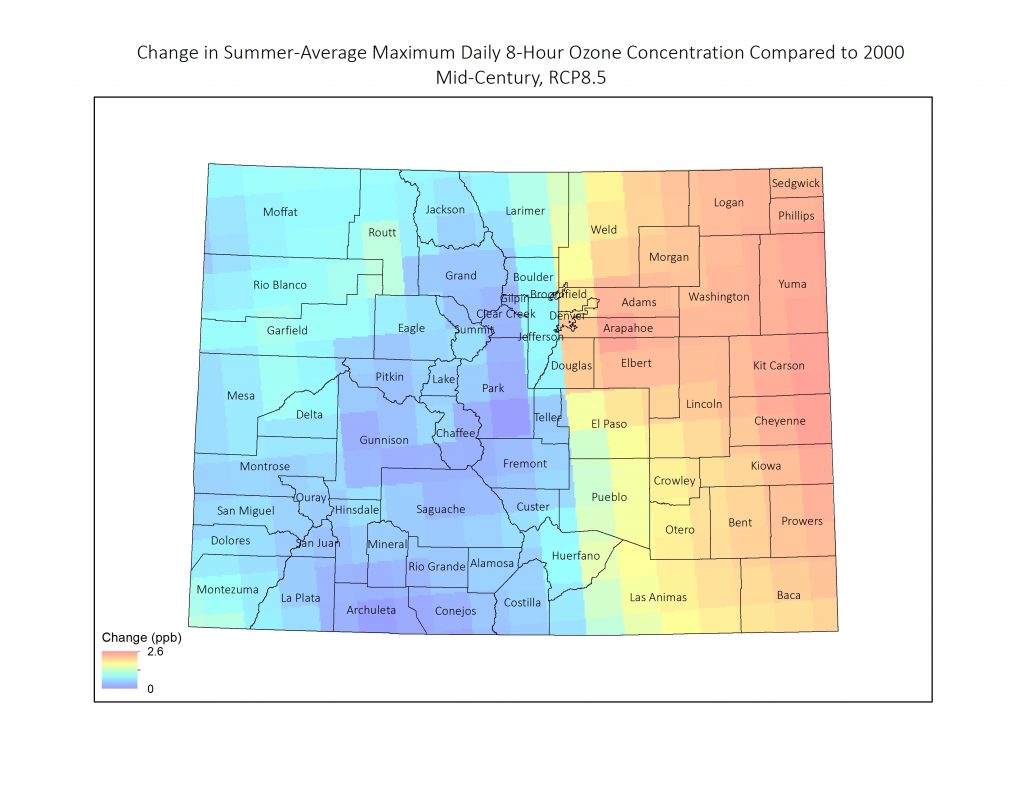
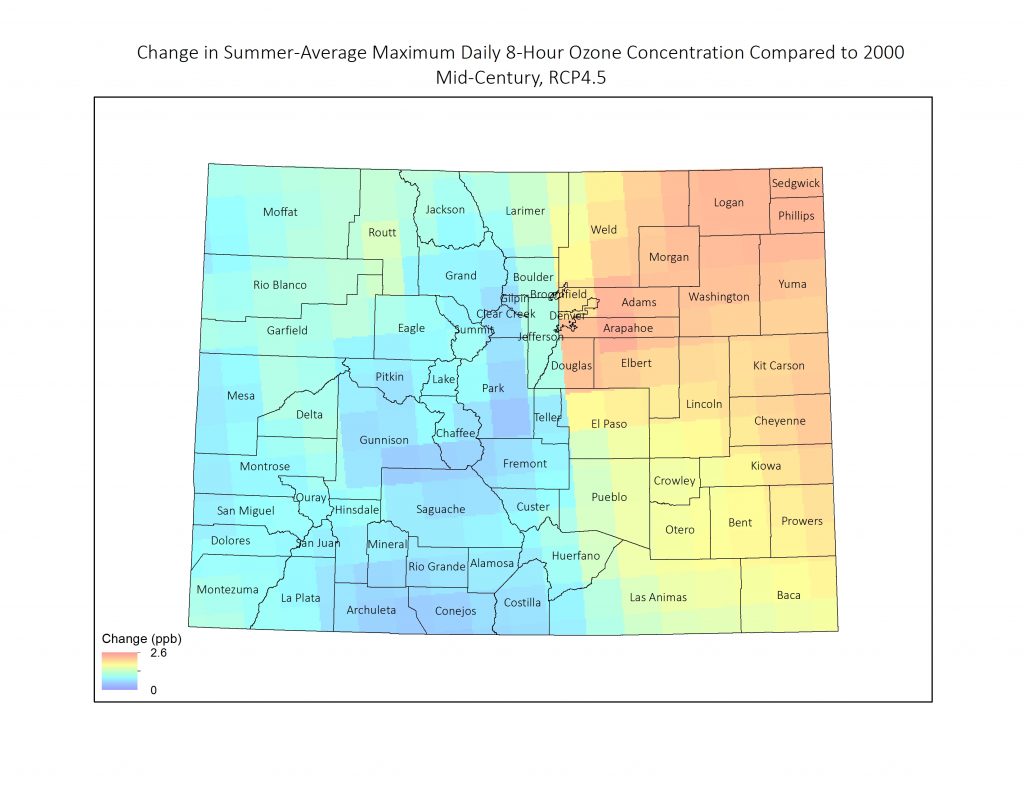
Slide the map to see two different emissions scenarios for ozone concentration levels compared to the year 2020; one for business-as-usual, and one where we reduce emissions to moderate levels. The lighter colors indicate the highest projected increase in ozone concentration levels. Under both emission scenarios, the highest increase in ozone concentration levels is projected to occur in the Northern Front Range, Northern Plains, and Southern Plains.
To learn about solutions and actions you can take on these issues visit Impacts and Solutions.
 HIGH
HIGH
 MODERATE