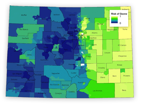
On this website, you will see a variety of maps indicating different levels of climate change risk for different parts of Colorado. The index on the top right shows which census tracts our analysis showed faced the greatest risks. Each tract is rated on a scale between 0 and 1, with 1 indicating a greater threat faced by climate impacts in comparison to the rest of the state. The light green color indicates lower levels while dark blue areas face the greatest threats.
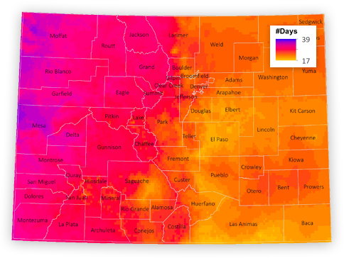
These maps indicate the impacts of various climate change events as a result of emission levels. In this case, the darker colors indicate a higher number of days where fire danger is very high in a moderate emission scenario. You will see other maps relating to extreme heat, air pollution, and drought, and in each of those the darker colors indicate the highest risk.